Editor Interface Navigation
The canvas is your main workspace in NappAI. From here, you can add components, test your automations, and manage your projects. This guide details each of the interface elements.
The Main Toolbar
This vertical bar on the right contains the key actions for managing and testing your project.
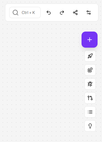
Add Component (+)
- Opens the components panel so you can search for and drag new components into your project.
Deployment and Consumption (Rocket Icon)
This button is the portal to taking your project to production. It is divided into two distinct functionalities. Before a project can be consumed externally, you must create an official “version” of it.
-
Step 1: Deploy a Version This option allows you to create a stable and published “version” of your project. It’s like taking a snapshot of your flow that can be used from outside NappAI.
- If you don’t have any previous versions created, NappAI will ask you to enter details for your first deployed version.
- If versions already exist, you can select them from the list to manage them.
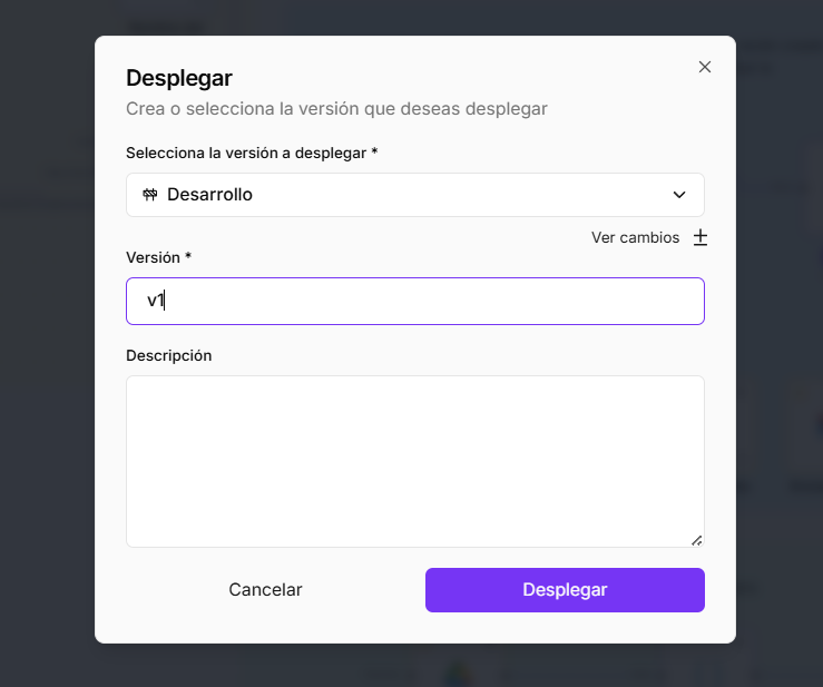
To create a version, you must configure:
- Select version to deploy: By default, it will be the active version of
# Development. - Version: Give this version a unique and descriptive name (e.g.,
v1.0.0,Initial-Production). This name will help you identify it later. - Description: Add an optional description to remember what changes or features this version includes.
Once you click the Deploy button, that version becomes “published” and ready to be consumed.
-
Step 2: Consume the Version (API Access) This option provides the necessary code to run your deployed version from an external application.
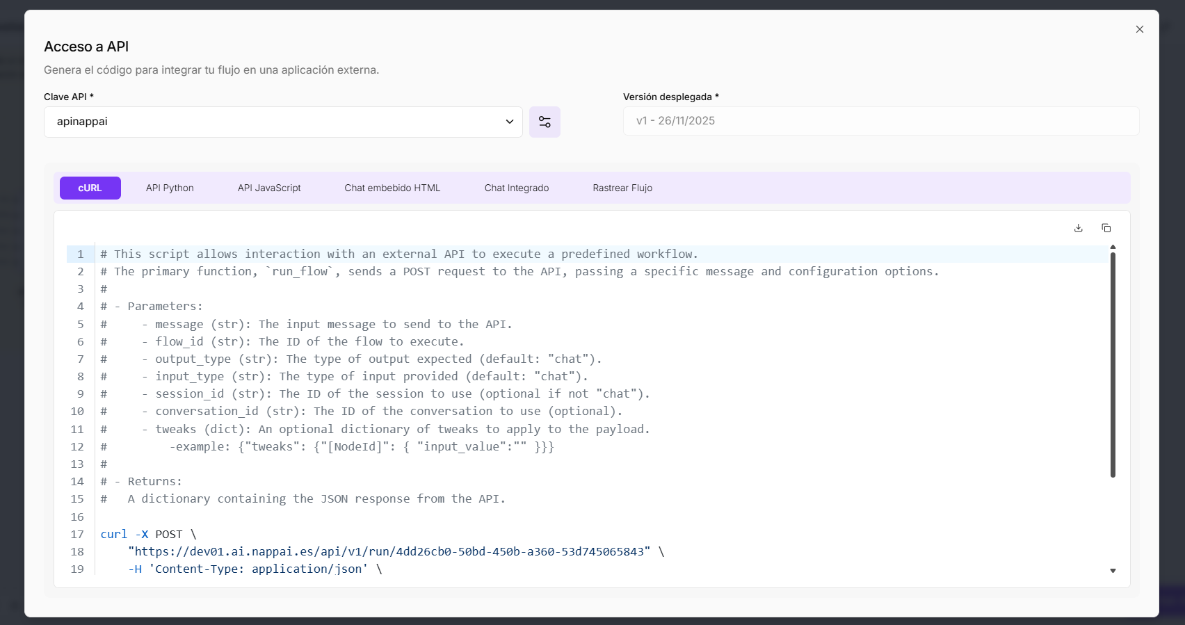
To generate the code, you must select:
- API Key: Choose an API Key that you have previously created. This key authorizes your external application to execute the flow. You can manage your keys in the Navigation Panel.
- Deployed Version: Select the version you just created (e.g.,
v1.0.0). It is crucial to select a deployed version to enable consumption.
Once the key and version are selected, NappAI will automatically generate code snippets in various languages (
cURL,Python,JavaScript, etc.) that you can copy and paste directly into your application to run this flow remotely.
Testing Environment (Bug Icon)
- Opens the Playground, the interactive interface for testing your flow in real-time without having to deploy it.
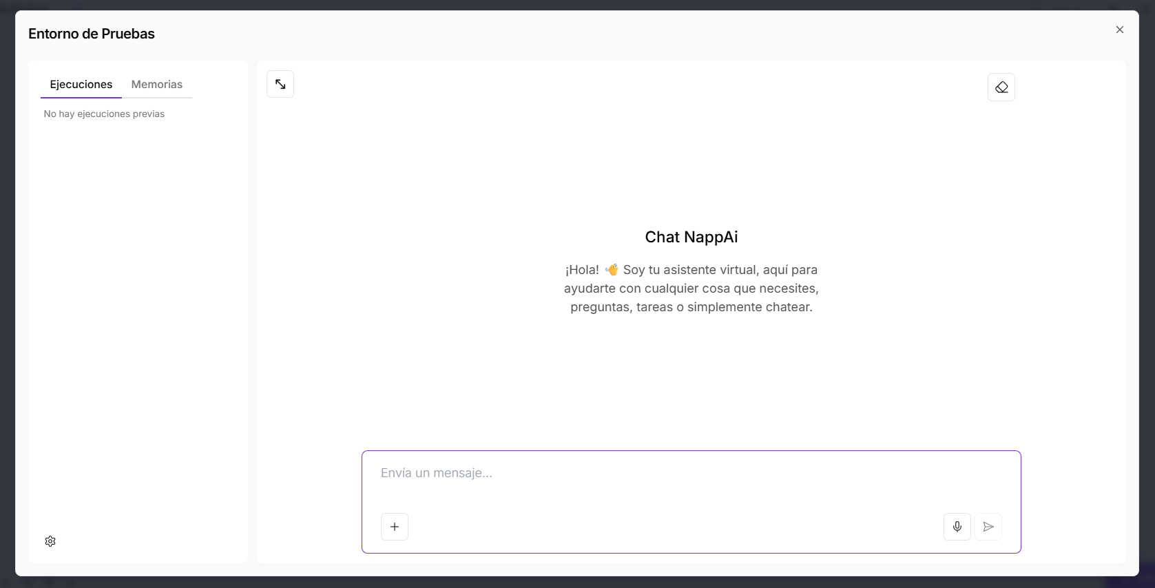 The panel on the left is divided into 2 options:
- Executions: This is the most important tab for debugging. Every time you send a message in the chat, a detailed log appears here showing how the flow executed, component by component.
- Step-by-Step View: You can click on each component of your flow (such as
Chat Input,Agent,Gemini) and see exactly the input data it received and the output data it generated. - Error Identification: If something fails, this is where you will see which component caused the error and why, making correction much easier.
- Step-by-Step View: You can click on each component of your flow (such as
- Memories: This tab manages the conversation history. When building conversational flows, it is crucial for the agent to remember past interactions to maintain context.
- Conversation History: Here you can see and manage the short-term and long-term memory the agent is using. This is fundamental for building coherent and advanced chatbots.
- Executions: This is the most important tab for debugging. Every time you send a message in the chat, a detailed log appears here showing how the flow executed, component by component.
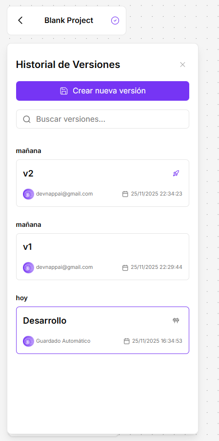
Version History
-
Purpose: This panel is your “time machine.” It allows you to manage, view, and restore different states of your project throughout its development. It is essential for maintaining change control and differentiating between your work in progress and stable versions.
-
History Components:
- Development Version: This is always the first in the list. It represents the current state of your canvas. All changes you make in real-time are automatically saved here. This version cannot be deployed directly; it is your draft or “sandbox.”
- Created Versions (e.g., 0.1, 0.2): These are “snapshots” or manual save points you have created. Each represents a specific state of your project at a given time.
- Rocket Icon (🚀): This icon appears next to a version to indicate it has been deployed. This means it is a stable version that can be consumed via the API. As seen in the image, version
0.1is deployed, while0.2is not.
-
Available Actions: When selecting a created version (like
0.2in the image), two main options appear:- Restore: This action replaces your current Development canvas with the content of the selected version. This is extremely useful if you want to return to a previous state of your project.
- Delete: This action permanently deletes a saved version. Important: You cannot delete a version that is currently deployed (the one with the rocket icon). You would first need to deploy a new version to “free up” the old one.
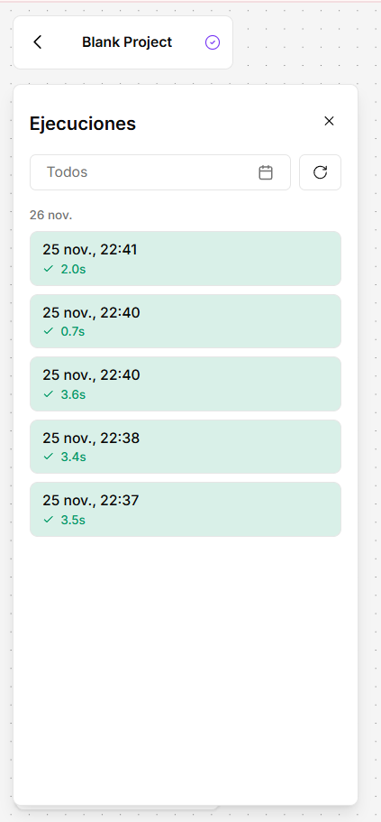
Logs / Executions
-
Purpose: This panel is your flight log. It shows a detailed history of every time your project has been executed outside of the Testing Environment (for example, via an API call or a scheduled task). It is your primary tool for monitoring and debugging your flows in production.
-
How to Read the Execution List:
- Each entry in the list represents a unique execution of your project, ordered chronologically.
- Color Coding: The list uses an intuitive color system so you can see the status of each execution at a glance:
- Green: The execution completed successfully, with no errors in any of the components.
- Red: The execution stopped due to an error in one of the components.
-
Inspect an Execution (Detailed View):
- Clicking on a specific execution in the list opens a detailed debugging view. This view is fundamental to understanding exactly what happened during execution.
- Step-by-Step Visualization: You can see an execution trace component by component. By selecting a component in the left panel (like
OpenAIin the image), the main panel will show you the exact Input data it received and the Output data it generated.
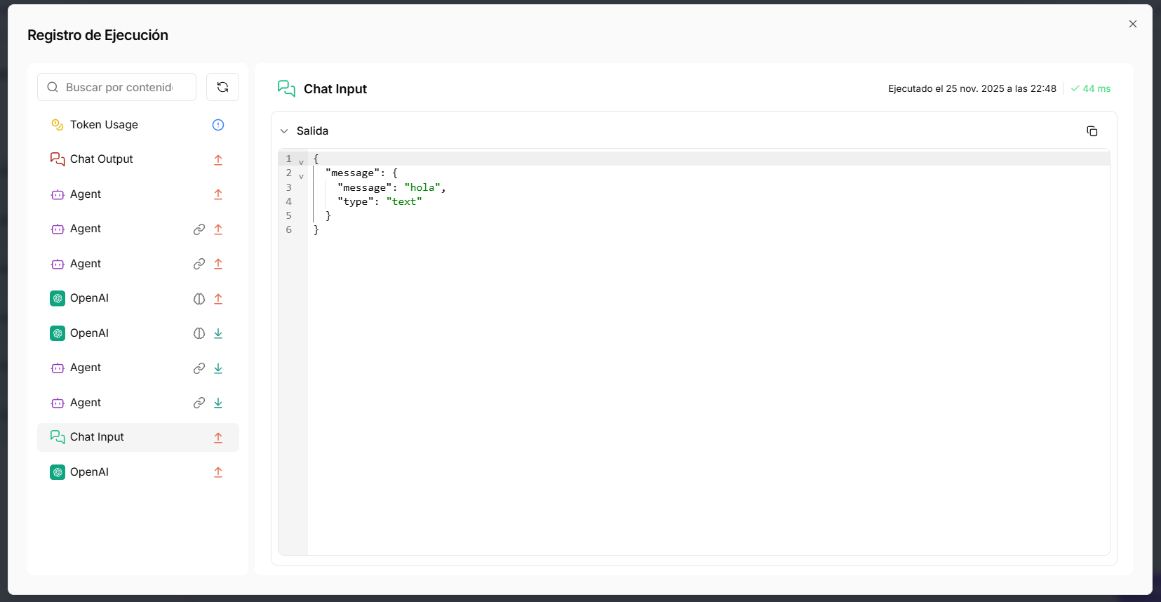
This inspection capability is invaluable for debugging errors, understanding why your flow took a particular decision, or verifying the data being processed at each stage.
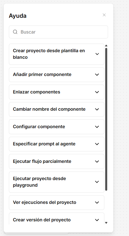
Help (Lightbulb Icon)
- Opens a contextual help panel with quick guides and tutorials on how to use the interface.
The Canvas Options Menu (Top Right Corner)
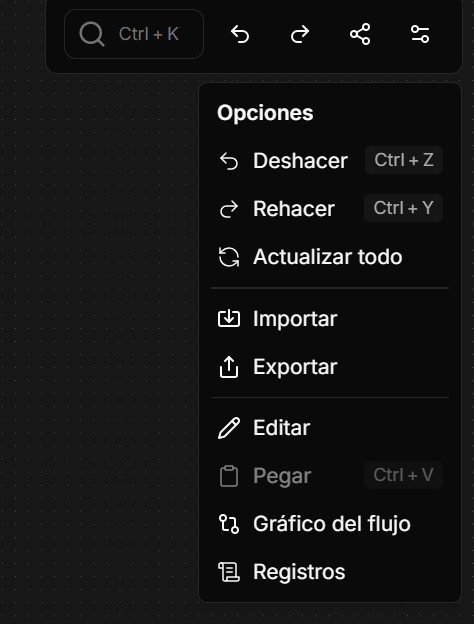
In the top right corner of the canvas, you will find a toolbar with quick actions to manage your workflow.
-
Undo (
Ctrl+Z): Reverts the last action you performed on the canvas, such as moving a component, creating a connection, or changing a setting. -
Redo (
Ctrl+Y): Re-applies the last action you undid. -
Copy and Paste (
Ctrl+C,Ctrl+V): You can select one or more components, copy them, and paste them onto the same canvas or into another project, keeping all their configurations. -
Refresh All: Reloads and updates the state of all components on the canvas. Useful if you have made changes to credentials or sub-flows and want them reflected immediately.
-
Flow Graph: Shows a visual representation of the dependencies and structure of your flow, helping you understand complex architectures.
-
Logs: Acts as a shortcut to the Execution Logs of this specific project, allowing you to debug and monitor without leaving the canvas.
Quick Actions on a Component
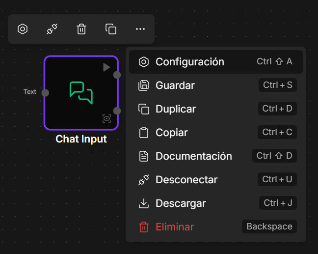
By right-clicking or using the menu of an individual component, you have access to a set of actions that streamline your work.
- Configuration: Opens the component’s settings panel.
- Save: Allows you to save a component’s current configuration as a “personal template” to quickly reuse it in other flows.
- Duplicate: Creates an exact copy of the component and its configuration on the canvas.
- Copy: Copies the component so you can paste it elsewhere.
- Documentation: Opens the specific documentation page for that component in a new tab.
- Disconnect: Removes all input and output connections from the component.
- Download: Exports the component’s configuration as a
.jsonfile. - Delete: Deletes the component from the canvas.
Canvas Controls
This toolbar at the bottom left allows you to control the view of your flow canvas.
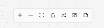
+/-: Increases or decreases the canvas zoom.- Center View (Expand icon): Automatically adjusts zoom and position so your entire flow is visible on the screen.
- Lock Flow (Lock icon): Locks flow editing. You won’t be able to move or delete components, but you will still be able to run it in the Testing Environment.
- Auto-arrange (Arrows icon): Automatically reorganizes your components on the canvas to follow a linear and orderly layout.
- Grid Layout (Squares icon): Toggles between two positioning modes on the canvas.
- Grid Mode (On): Forces components to align to a predefined grid.
- Auto Mode (Off): Allows you to move and position components with total freedom.
- Add Note (Paper icon): Allows you to add sticky text notes directly on the canvas to document parts of your flow.